For those of us of an older generation, photography started as a black and white medium – in a cupboard under the stairs or in a bathroom draped with black-out cloth, smothered in the smell of developer and fixer, our prints hanging from a clothes line hung over the bath or a basin…. and it remains a strong and perhaps nostalgic memory. And whilst black and white images are nowadays very simple to produce – the press of a button on a mobile phone or a click on our computers – for many of us, the images retain their fascination and power.
So – what images work best in black and white and when does one choose to make an image monochrome rather than colour? I would suggest it requires a critical eye for an image and an understanding of the benefits of one versus the other.
The human eye sees in colour – and this can be used creatively by the photographer to catch the viewer’s attention or suggest time and mood. A bright colour such as red or yellow for your subject will draw the eye, whilst a warm colour may suggest summer or cool colours such as blue are perhaps appropriate for winter or to infer sadness and loneliness. And some colours do not translate into monochrome very satisfactorily – reds and greens are very distinct in a colour image but tend towards similar tones when transformed into a mono version, for example.
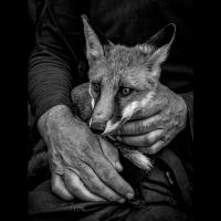
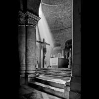
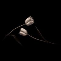
However, photography is all about the use of the light – and a mono image is seen only in black and white, emphasising the essentials of light and shade in the purest of terms. However, an image mainly of tones of grey will appear flat and lifeless, so contrast, with a full range of tones (including deep black and a good white) is usually necessary for a satisfying monochrome image. The photographer will use the lighter areas of the image to draw attention, the darker areas and deep shadows to add presence, atmosphere and drama. And some photographers, particularly fine art workers, often have a preference for working in black and white as the removal of colour gives mono images an almost timeless quality. So portraits, whether of people or of animals, are a popular choice for the use of monochrome – the light and shade on the face and head giving modelling and depth to the image, the sitter’s mood and character in particular exposed for all to see. But monochrome suits many different genres – still life such as flowers and architectural interiors as the ones shown here for example – and is well worth exploring for everyone with a camera.
If your camera permits, shoot in RAW as this retains maximum detail, and allows the photographer the greatest manipulation of that information in producing the final image.
In the end, of course, the choice of colour or monochrome is down to you, the photographer, your creativity and your vision of the intended image – but whichever it is, make sure the choice adds something to the image in terms of mood, impact and its “wow” factor.
However you take your images, if you like the result, then good enough – your shots will provide pleasure and enjoyment. Check out our website – www.iomps.com and our Facebook page for more ideas to stimulate and inspire your photography.
Chris Blyth


